Short answer: with Compose BOM 2026.11.01 (Compose 1.13, released 18 Nov 2026), Google calls FlexBox and Grid stable and deprecates ConstraintLayout and MotionLayout in Compose. Most ConstraintLayout screens move without drama: chains become a FlexBox, guidelines and barriers become Grid tracks, and a ratio becomes Modifier.aspectRatio. Two things have no one-line replacement: overlap tricks such as centerAround, and bias. Start by counting what your code actually uses (script below), because in the samples we scanned the answer was “very little”.
The upgrade needs Kotlin 2.2 or newer and compileSdk 37.1, per the release post. FlexBox and Grid ship in androidx.compose.foundation:foundation-layout 1.13.0, so there is no new dependency.
Why we did this: some Shopkeeper screens and parts of the BMDB.fun TV app still lay out with constraintlayout-compose, and we want the port planned before the deprecation shows up as build warnings.
What Google actually announced, and what it did not
The release post says, word for word: “we are officially deprecating ConstraintLayout and MotionLayout in Compose (androidx.constraintlayout:constraintlayout-compose artifact)”, and “We recommend migrating your ConstraintLayout Compose usages to the alternatives above.” The alternatives it means are the newly stable FlexBox and Grid layouts, plus the Shared Element APIs for what MotionLayout did.
Two details worth knowing before you plan the work:
- The constraintlayout release notes still list
constraintlayout-compose1.1.2 (29 Jul 2026) as the latest stable, and we found no release there that carries the deprecation yet. The library page already says the whole ConstraintLayout group “is in maintenance mode and will only receive critical fixes”. Your existing screens keep working; the pressure is new features and fixes going elsewhere. - The post also says FlexBox “supersedes the Flow layouts (
FlowRowandFlowColumn)” and recommends FlexBox for new code. Flow layouts are not deprecated. They are just no longer the first choice.
How much ConstraintLayout do you actually have?
We wrote a 25-line scanner that counts the ConstraintLayout features that need a decision (chains, guidelines, barriers, bias, ratio, centerAround, ConstraintSet) plus Flow layouts, and ran it on four of Google’s open-source sample repos: compose-samples at 09aae20, nowinandroid at 2982e63, sunflower at 2a357a3 and snippets at 7942b52.
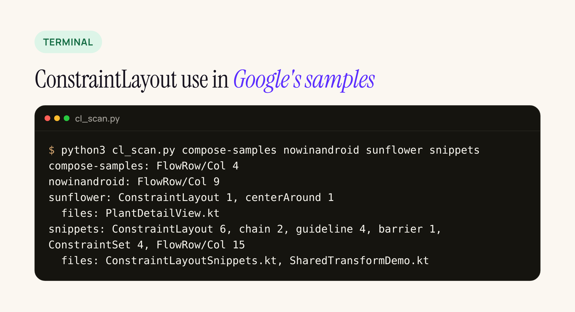
Real output of the scanner on Google’s sample repos.
Of the full sample apps, only Sunflower uses ConstraintLayout at all: one layout in PlantDetailView.kt, pinned to constraintlayout-compose 1.0.1, and its only non-trivial constraint is centerAround(image.bottom) for the floating button. The rest is in the snippets repo, which exists to document the API. Run the script on your own code before estimating:
#!/usr/bin/env python3
"""Count ConstraintLayout-in-Compose features in a repo."""
import pathlib, re, sys
PAT = {
    "ConstraintLayout": r"\bConstraintLayout\s*[({]",
    "MotionLayout": r"\bMotionLayout\s*\(",
    "chain": r"create(Horizontal|Vertical)Chain",
    "guideline": r"createGuidelineFrom",
    "barrier": r"create\w*Barrier",
    "bias": r"\b(horizontal|vertical)Bias\b|linkTo\([^)]*bias",
    "ratio": r"Dimension\.ratio",
    "centerAround": r"\bcenterAround\(",
    "ConstraintSet": r"\bConstraintSet\s*[({]",
    "FlowRow/Col": r"\bFlow(Row|Column)\s*\(",
}
for repo in sys.argv[1:]:
    hits = {k: 0 for k in PAT}; files = set()
    for f in pathlib.Path(repo).rglob("*.kt"):
        t = f.read_text(errors="ignore")
        for k, p in PAT.items():
            n = len(re.findall(p, t))
            if n and k != "FlowRow/Col": files.add(f.name)
            hits[k] += n
    used = ", ".join(f"{k} {v}" for k, v in hits.items() if v) or "none"
    print(f"{pathlib.Path(repo).name}: {used}")
    if files: print("  files:", ", ".join(sorted(files)))
python3 cl_scan.py app feature-* core-ui
It is a regex count, not a parser: it tells you which rows of the table below you need to read, not whether a screen is easy.
Every ConstraintLayout feature, mapped
Built from the Compose 1.13 guides for FlexBox containers, FlexBox items, Grid containers and Grid items.
| ConstraintLayout | Replacement in Compose 1.13 |
|---|---|
linkTo stacks |
Column, or FlexBox with direction(. Most “constraints” are just a column |
Chain, Spread |
FlexBox, justifyContent( (container behaviour) |
Chain, SpreadInside |
FlexBox, justifyContent( |
Chain, Packed |
FlexBox, justifyContent( plus gap( |
| Chain weights | Modifier.: extra space shared by ratio (item behaviour) |
fillToConstraints |
flex { grow( or a 1. Grid track |
| Guideline at a percent | Grid track as a Float, e.g. column( (track sizing) |
| Guideline at a dp | Grid track as Dp, or plain padding |
| Barrier after the widest label | column(: the column sizes to its widest cell |
| Spanning | Modifier. or a named area( (item properties) |
Dimension. |
Modifier.: not a layout container job |
| Bias | Box with BiasAlignment(; no FlexBox or Grid equivalent |
centerAround, overlap |
Box plus offset, or a custom Modifier.; Grid and FlexBox do not overlap items for you |
ConstraintSet per orientation |
Branch inside the config lambda on window size: it is ordinary Kotlin |
Wrapping (Flow helper) |
FlexBox with wrap( and maxItemsInEachLine; replaces FlowRow too |
MotionLayout |
Shared Element APIs, animate*AsState (per the release post; not covered here) |
A rule of thumb from the guides: FlexBox is for “a small number of items within an overall screen layout”, Grid for the overall screen, and neither lazy-loads. A long list stays a LazyColumn or LazyVerticalGrid; to put one inside a Grid, give its track GridTrackSize.MinMax(0.dp, 1.fr), because a lazy list in a plain flexible track throws an IllegalStateException according to the Grid docs.
A real screen both ways: label and value rows
The pattern we use most in banking-style account cards is two columns: labels on the left, values starting where the longest label ends. In ConstraintLayout that is a barrier. In Grid it is one MaxContent track.
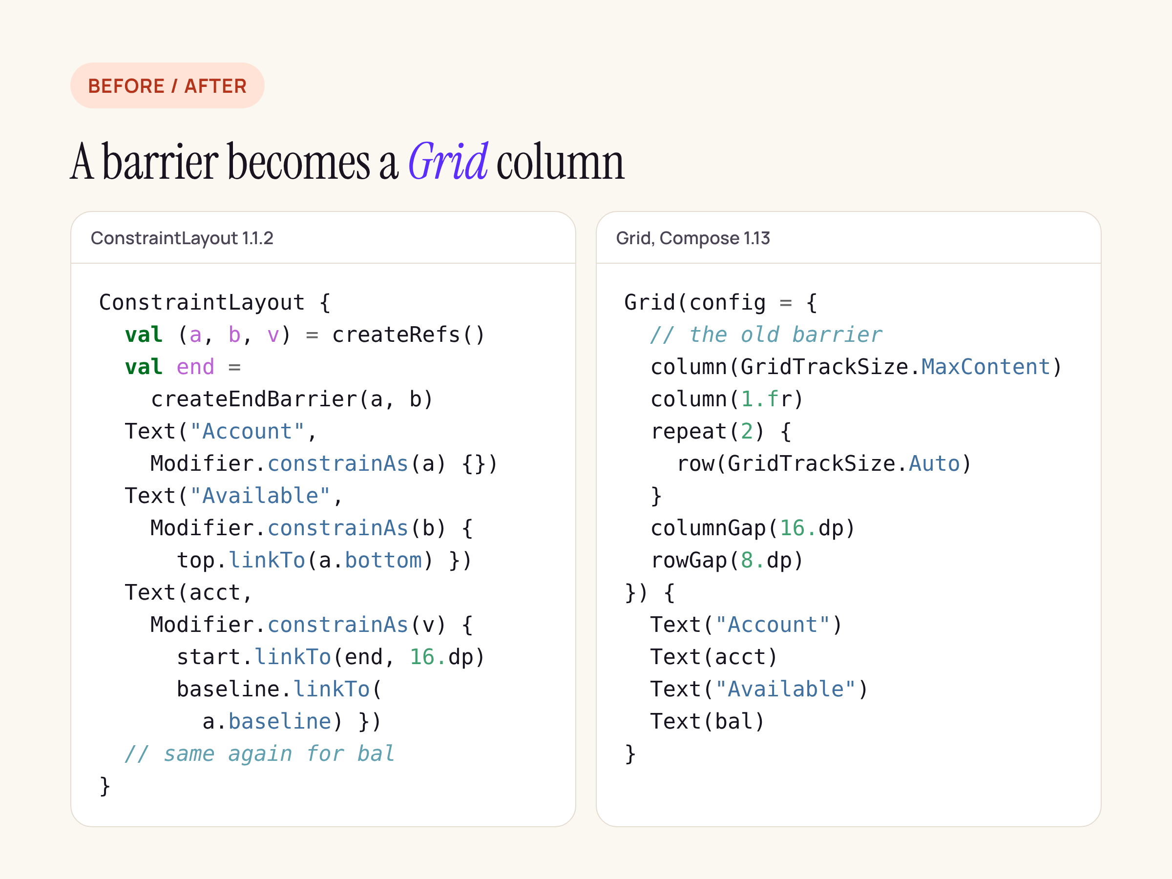
The barrier becomes a column sized to its widest cell.
Grid(
    config = {
        column(GridTrackSize.MaxContent) // the old barrier
        column(1.fr)                     // values take the rest
        repeat(2) { row(GridTrackSize.Auto) }
        columnGap(16.dp)
        rowGap(8.dp)
    }
) {
    Text("Account")
    Text(accountNumber)
    Text("Available")
    Text(balance, style = MaterialTheme.typography.titleMedium)
}
Grid auto-places children row by row, so the four Text calls fill the two rows in order. One thing does not carry over: ConstraintLayout let you link baseline to baseline, while Modifier.gridItem(alignment = ...) takes an Alignment, which has no baseline option. With mixed font sizes, as above, check the row visually; if it matters, keep that pair in a Row with Modifier.alignByBaseline().
Chains become FlexBox
A three-button action row with ChainStyle.SpreadInside and a weighted middle button:
FlexBox(
    config = {
        justifyContent(FlexJustifyContent.SpaceBetween)
        alignItems(FlexAlignItems.Center)
        gap(8.dp)
    }
) {
    OutlinedButton(onClick = onPay) { Text("Pay") }
    Button(
        onClick = onTransfer,
        modifier = Modifier.flex { grow(1f) }
    ) { Text("Transfer") }
    OutlinedButton(onClick = onMore) { Text("More") }
}
On a phone this is one row. Add wrap(FlexWrap.Wrap) and the same row breaks onto a second line on a narrow cover screen instead of squeezing the labels, which is exactly what Play’s new adaptive tier checks for (see our Tier 3 post).
The two that need thought: centerAround and bias
Sunflower’s plant screen puts the floating button half over the bottom edge of the hero image with centerAround(image.bottom). Neither FlexBox nor Grid places one item relative to another item’s edge. The plain Compose version is a Box:
Column(Modifier.verticalScroll(scrollState)) {
    Box {
        PlantImage(imageUrl, imageHeight)
        if (!isPlanted) {
            PlantFab(
                onFabClick = onFabClick,
                modifier = Modifier
                    .align(Alignment.BottomEnd)
                    .padding(end = Dimens.PaddingSmall)
                    .offset(y = 28.dp) // half the FAB height
            )
        }
    }
    PlantInformation(/* ... */)
}
The offset value is half the button’s height, which ConstraintLayout used to work out for you. If the button size changes with font scale, measure it in a Modifier.layout block instead of hard-coding the number. Also note the draw order: the FAB now sits inside the image’s Box, so PlantInformation drawn after it can cover the lower half. Put Modifier.zIndex(1f) on the image’s Box (it is a sibling of PlantInformation inside the Column, so that is where zIndex takes effect).
Bias (linkTo(parent.start, parent.end, bias = 0.3f)) maps to BiasAlignment(horizontalBias = -0.4f, verticalBias = 0f) in a Box. The scales differ: ConstraintLayout bias runs 0 to 1, BiasAlignment runs -1 to 1, so the conversion is 2 * bias - 1.
Port order we would follow
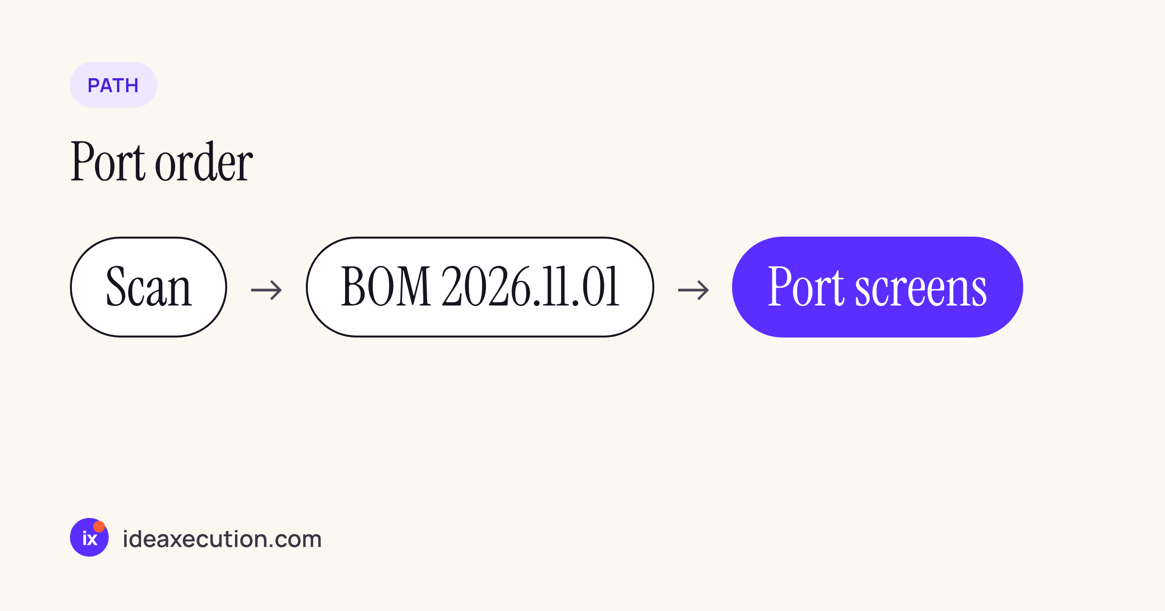
- Run the scanner and list the screens with chains, barriers, bias or
centerAround. - Move to BOM 2026.11.01 on its own (Kotlin 2.2+,
compileSdk 37.1) and ship that before touching layouts. - Port the simple stacks to
Columnfirst; they are usually the majority. - Port barrier and guideline screens to
Grid, chains toFlexBox. - Leave overlap screens on
Boxand removeconstraintlayout-composefrom the build only when the scanner reports zero.
The Kotlin in this post is a starting point to adapt and compile against your own screens; the API names and parameters come from the Compose 1.13 guides linked in each section. Visual checks on rotation, fold and font scale are the part only your own devices can sign off.